In this digital era adequately keeping your data is essential. Data enables firms to assess the successful outcome of a specific strategy. When tactics for an issue are implemented, gathering data will allow you to determine how well your solution is doing and whether your approach needs to be altered or changed in the long run. Gathering information can help to develop enhanced services, examine customer needs, improve and modify business strategy, and bring in and retain customers.
Odoo 16 introduces new features to the dashboard module where one can arrange the data reliably. Let us see how various data can be taken to the dashboard.
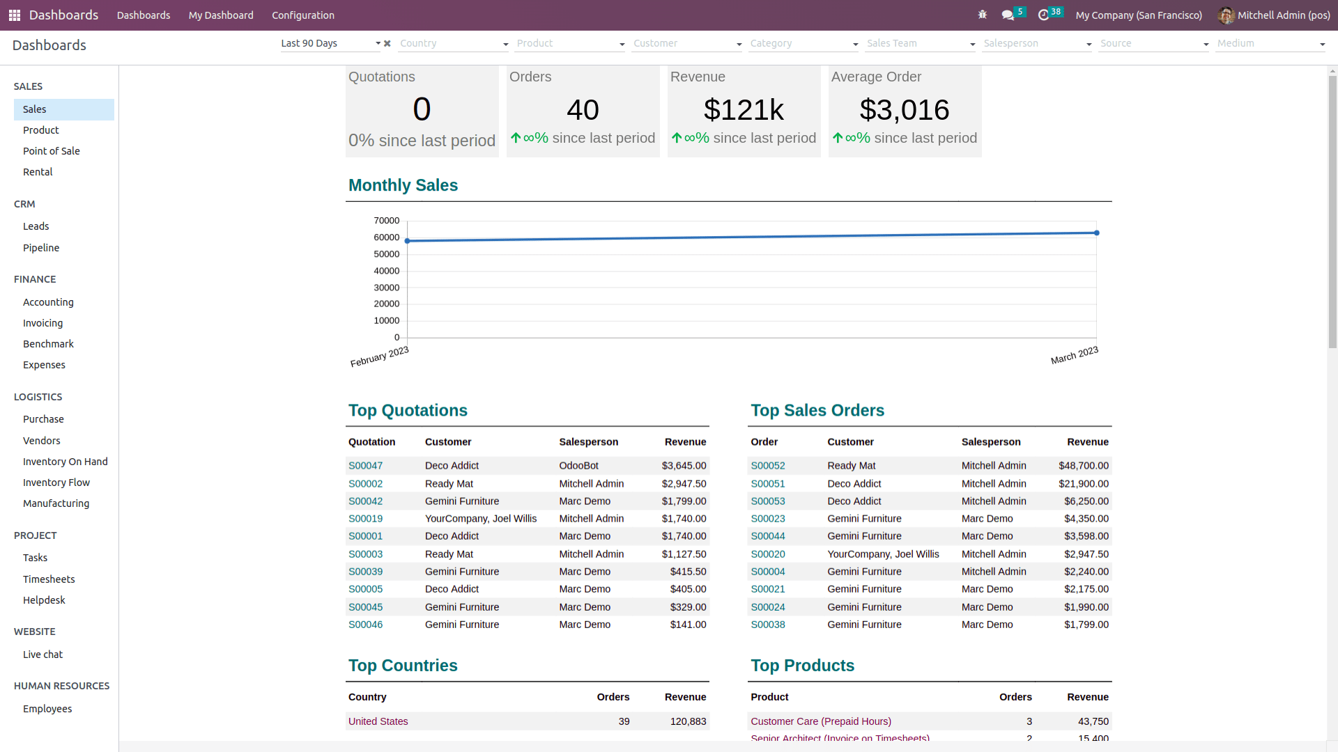
Once the dashboard is open we will be able to the existing dashboards with a lot of information. On the left-hand side, it shows the dashboard says sales, products, point of sale, and so on. One will be able to create a dashboard based on the requirement and kind of information that needs to appear in the dashboard. Also, filters are available at the top to filter from the dashboard data. Filters can be made in custom as well.
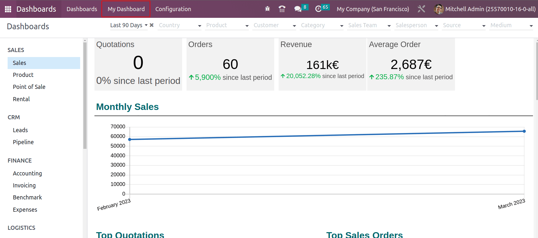
Every module has an ‘Add to Dashboard’ option to add data to the dashboard from the respective module. The menu ‘My dashboard’ is the default dashboard of the user. Users can add data to their default dashboard as they want.
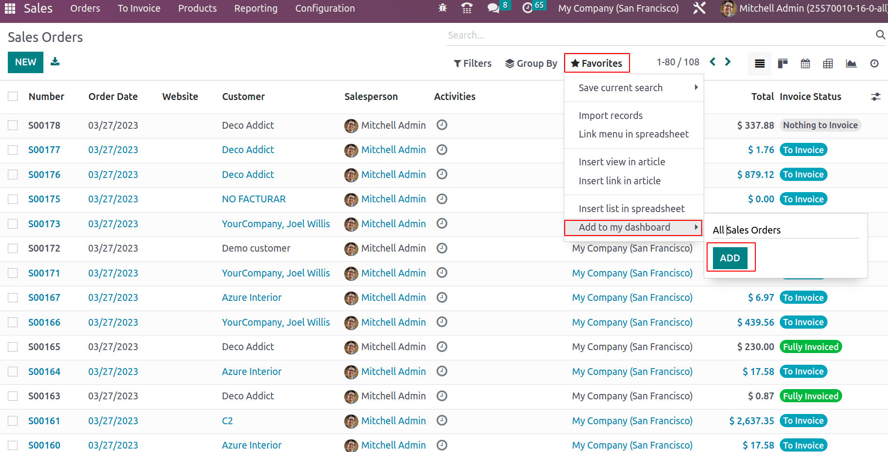
The ‘Add to Dashboard’ feature adds data to the default user dashboard. Consider if all Sales orders are added to the dashboard. Go to the sales module and take all sales orders. Under favorites, choose ‘Add to Dashboard’ and add the name for the dashboard data. Click on ADD button, which adds the data to the default dashboard.
Once the data is added to the dashboard, refresh the browser to update the data in the default dashboard and go to ‘My dashboard’. One can see that added details appear in the dashboard. Similarly, any views and reports can be able to add the default dashboard.
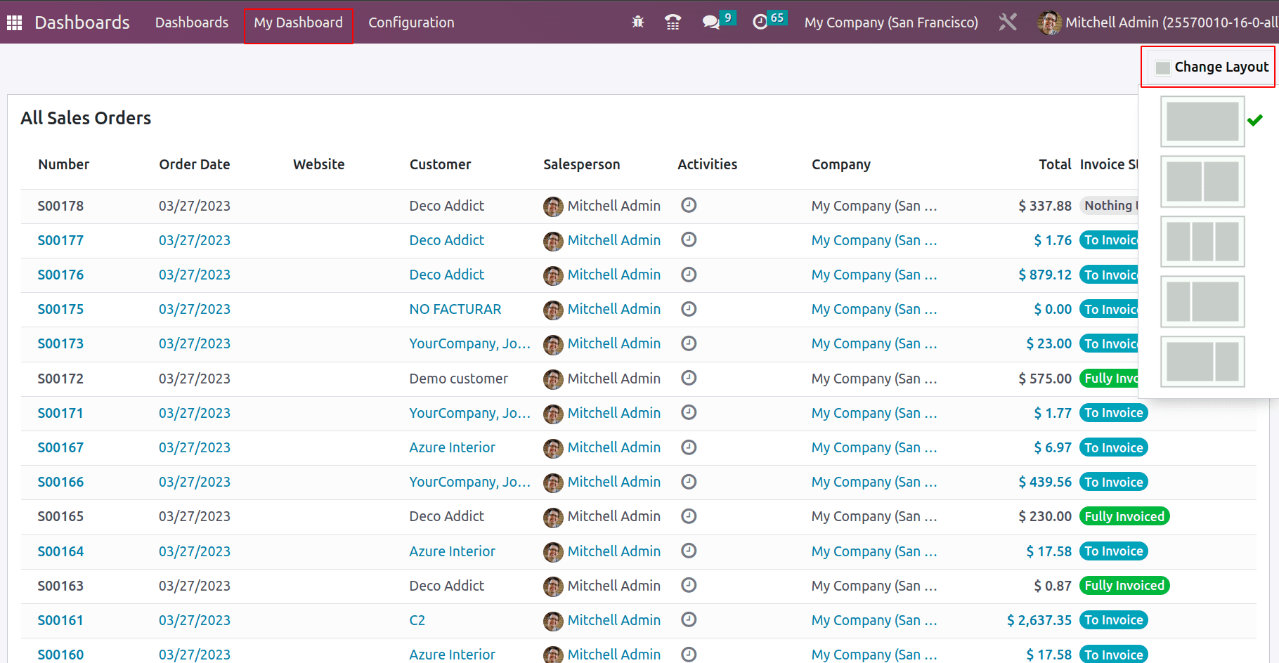
The layout for the dashboard can be updated with the ‘Change Layout’ option.
If the added dashboard data have some filter and if any of the records come out of the filter, they will be automatically removed from the dashboard. For example, if one has added the sale orders with invoicing status ‘To invoice’ into the dashboard. Whenever the invoice is created for any of the sales orders from that added list, then its invoicing status changes to ‘Fully Invoiced’, and thus that particular sales order will be removed automatically from the dashboard. Similarly when a new sales order is generated with invoicing status ‘To Invoice’, which will be automatically added to the dashboard under the filter.
Creating Custom Dashboards
From the configuration > dashboard, one will be able to view all the available dashboards and create a new custom dashboard.
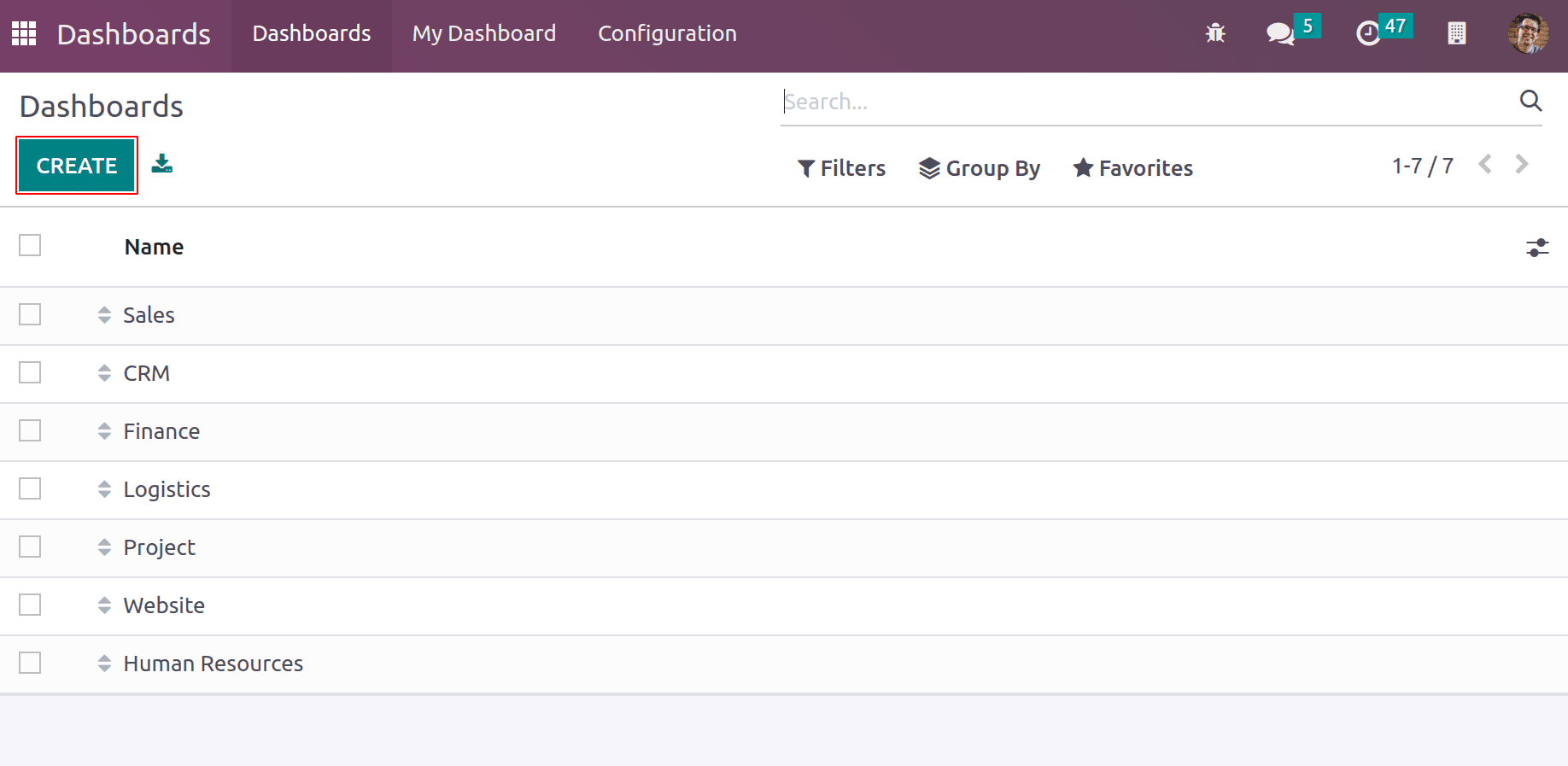
The create option facilitates adding the dashboard name. Spreadsheet documents can be added to the dashboard and charts, graphs can be added to the dashboard based on the data.
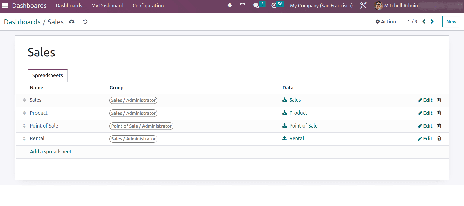
The edit option enables editing the spreadsheet file.
Let’s create a custom dashboard, say ‘MyDashboard’, where spreadsheet documents can be uploaded with the group.
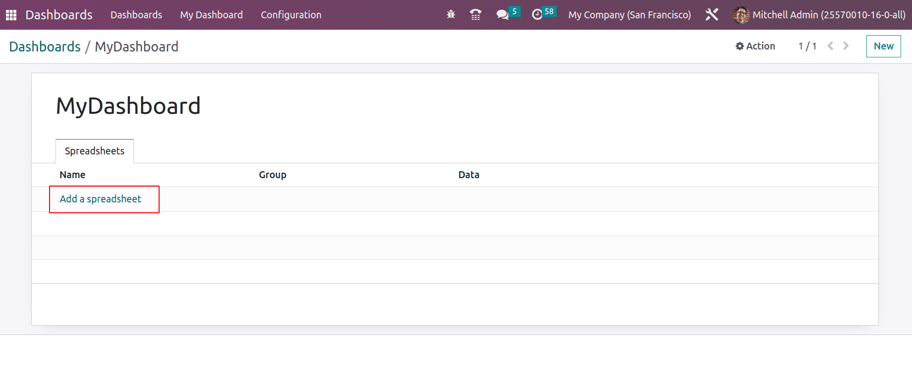
The ‘Add a spreadsheet’ option opens a window where one can search for the spreadsheet on MyDashboad.
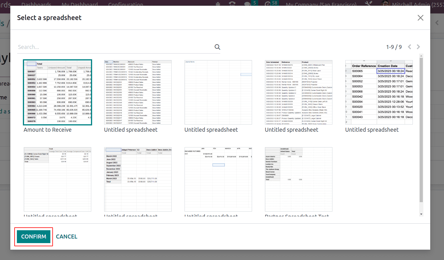
One can directly create the spreadsheet data from the documents module with the data templates and other modules.
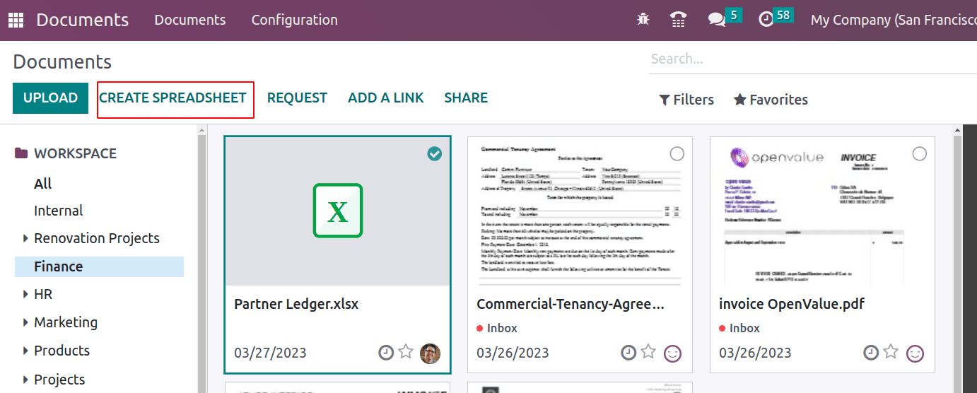
The CREATE SPREADSHEET button opens up a window where one can add/create the spreadsheet.
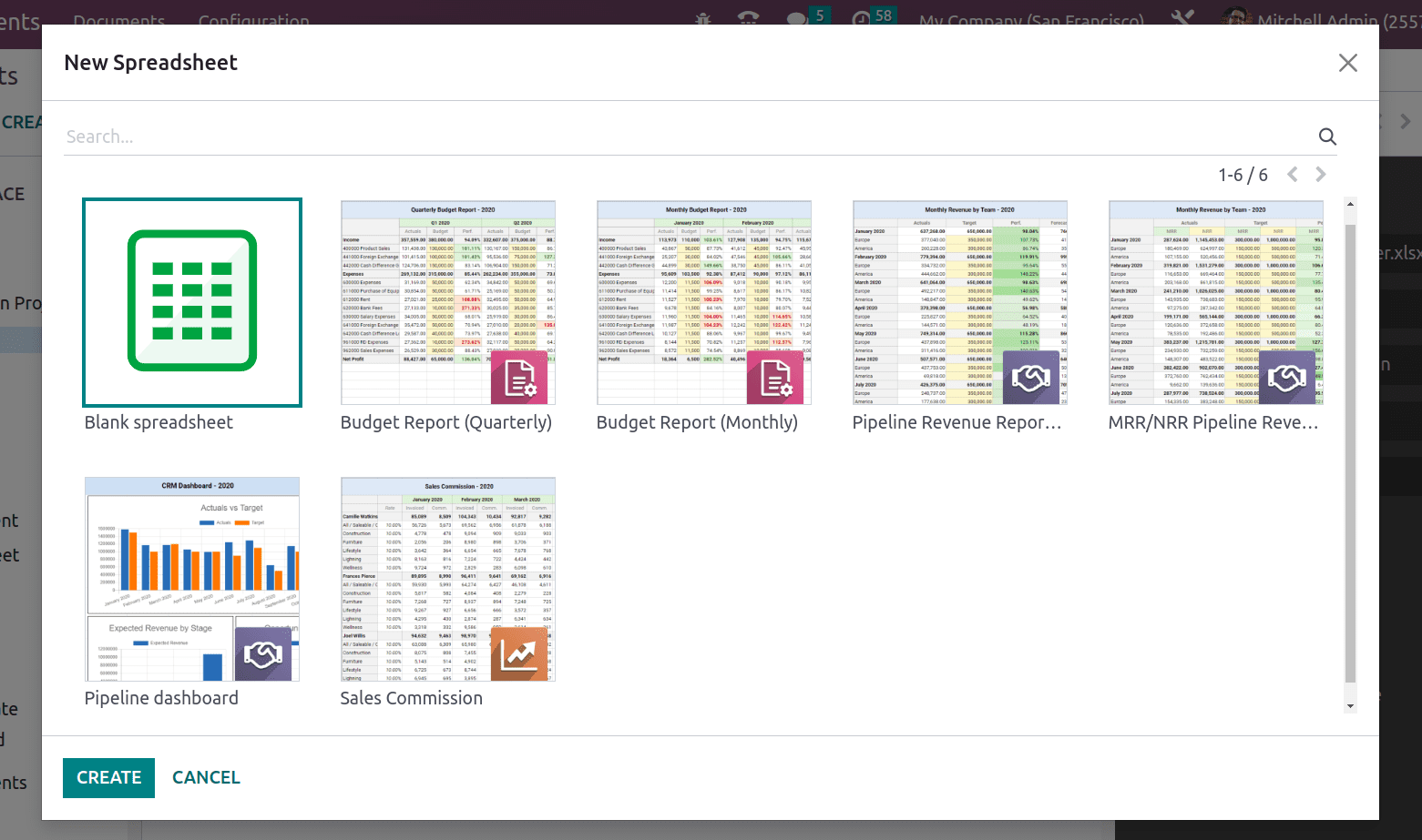
One can use a blank spreadsheet as well to add own data or can choose from the given. And more columns or rows can also be possibly added if any other computation is planned from the existing data.
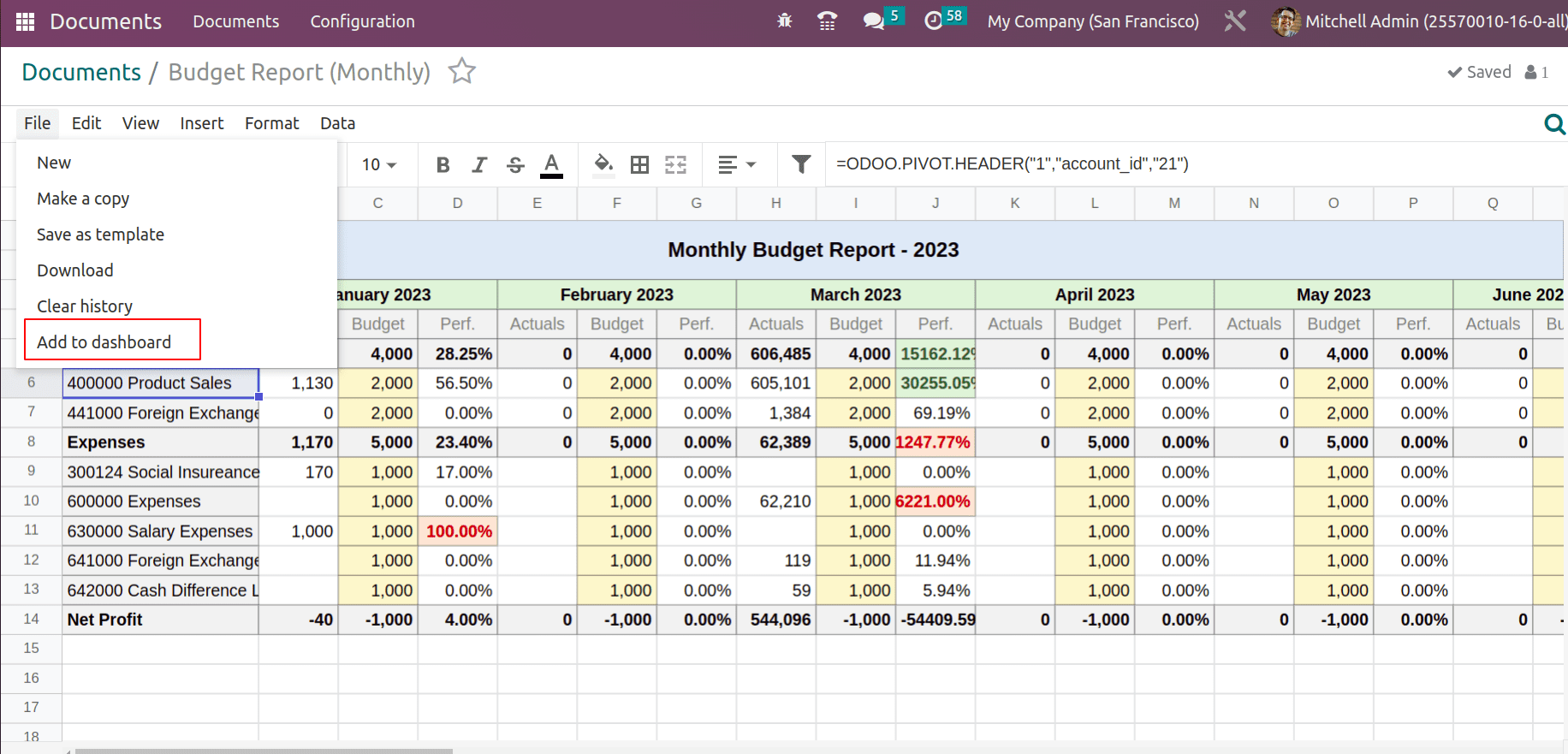
The ‘Add to dashboard’ under the menu file, adds the spreadsheet to the dashboard we are mentioned.

Thus the newly created spreadsheet was added to MyDashboard. If require Access Groups can also be decided at this stage.
As you have created a dashboard and spreadsheet files are added to your dashboard, one can see the details from the dashboard Overview itself.
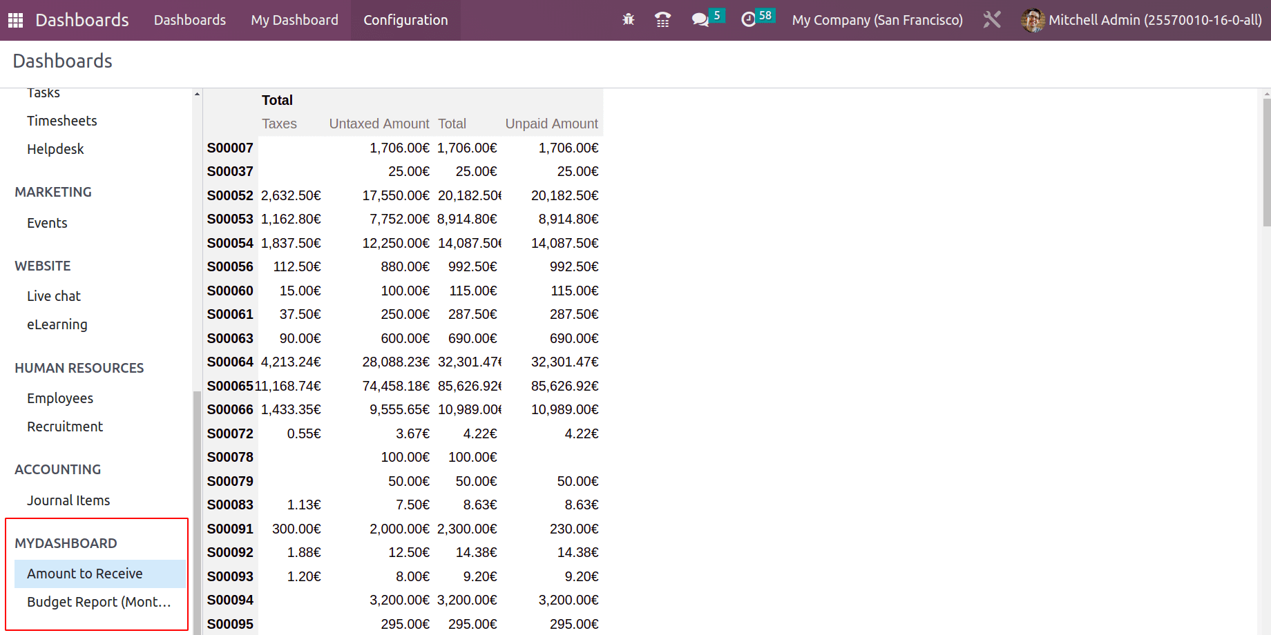
Now let us see if more data can be taken to the dashboard based on this existing data. Go to dashboard and edit the spreadsheet file.
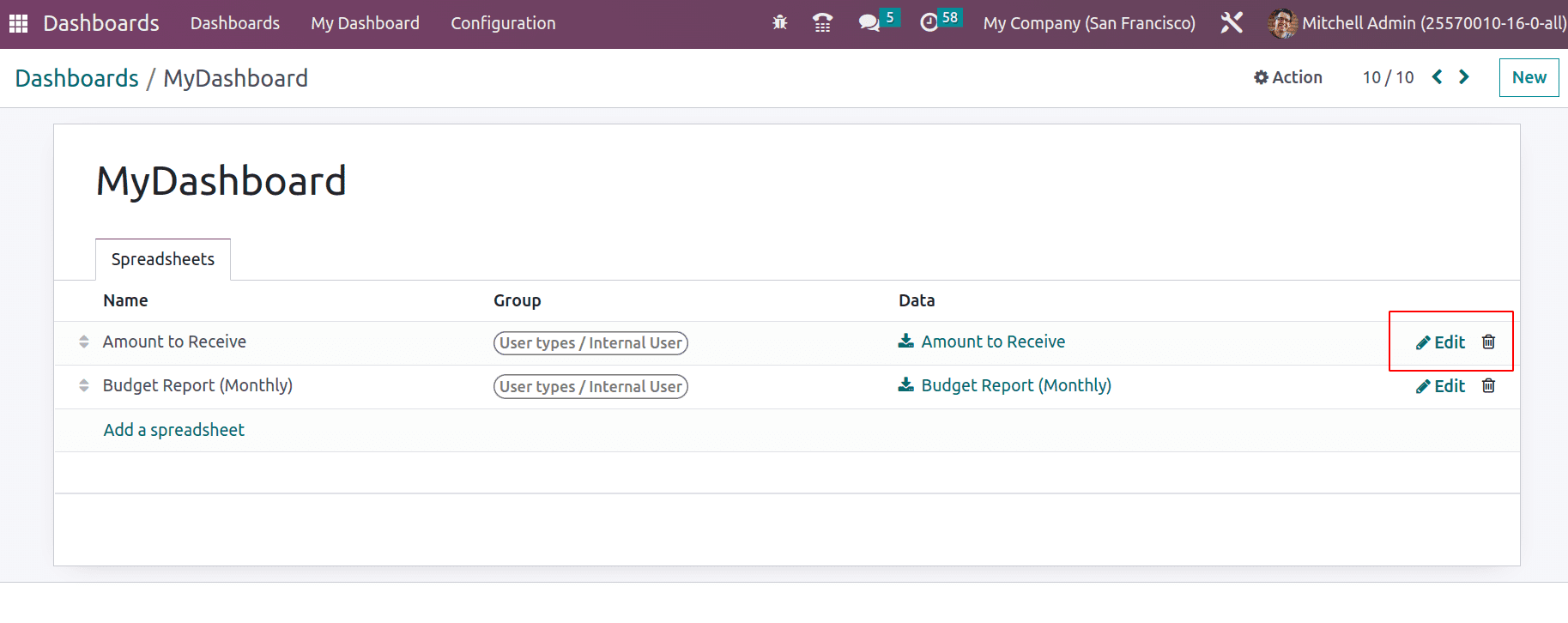
This opens up the spreadsheet and adds charts to the spreadsheet data.
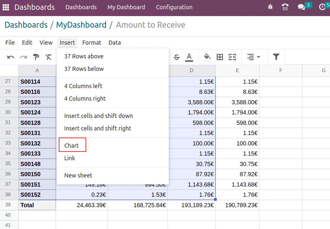
Choose the data table corresponding to which the charts need to be generated. From the menu Insert > Chart inserts different charts including Bar, Guige, scorecard, Line, and Pie graph.
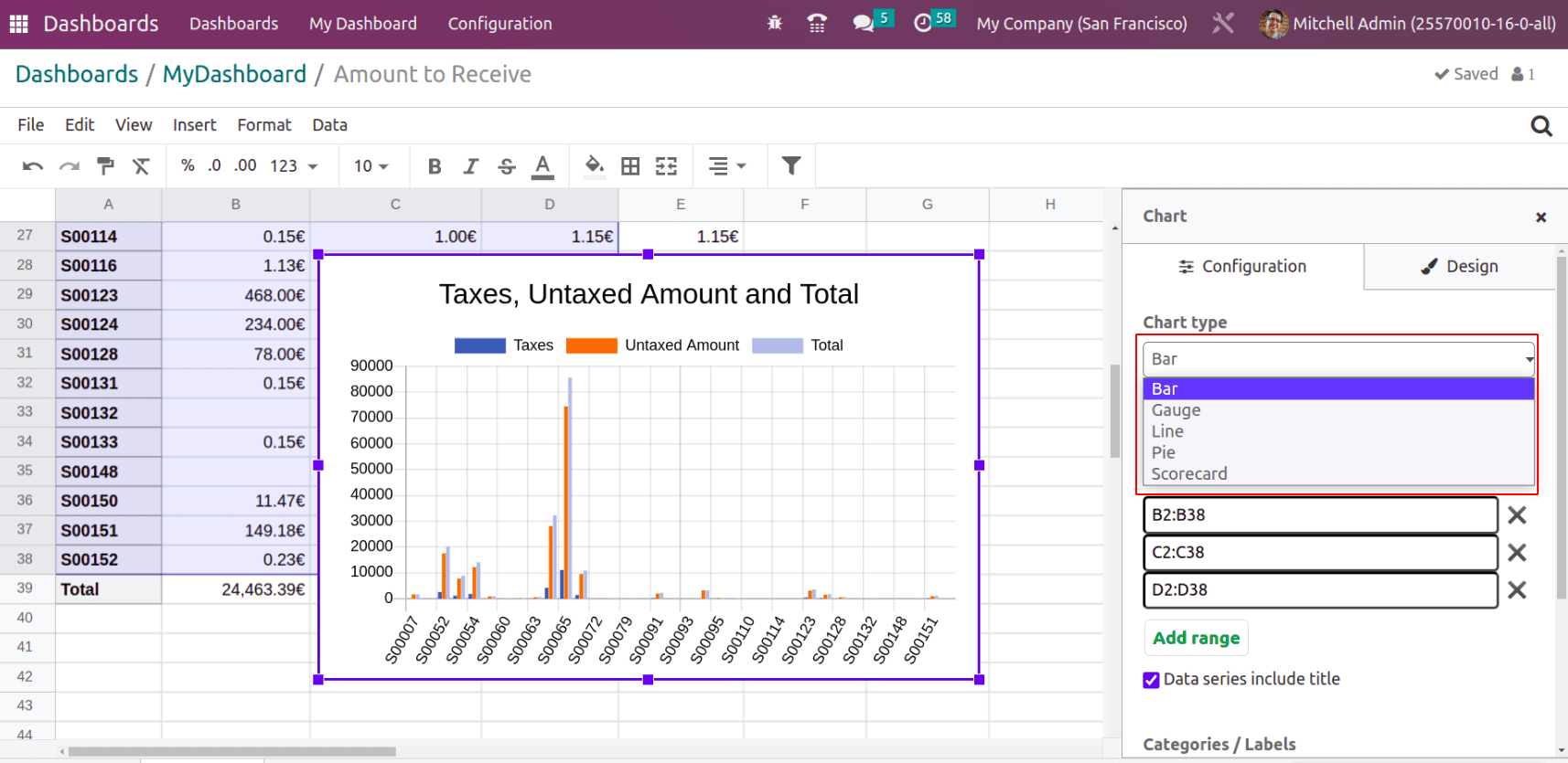
Under the configuration, tab chooses the chart type. If your chart data need to include the title, check the box ‘data series include the title’. In the Design tab, the background color can be set. Also, the title of the chart, the Vertical axis position can be set as left or right and the legend position to top, bottom, left, or right.
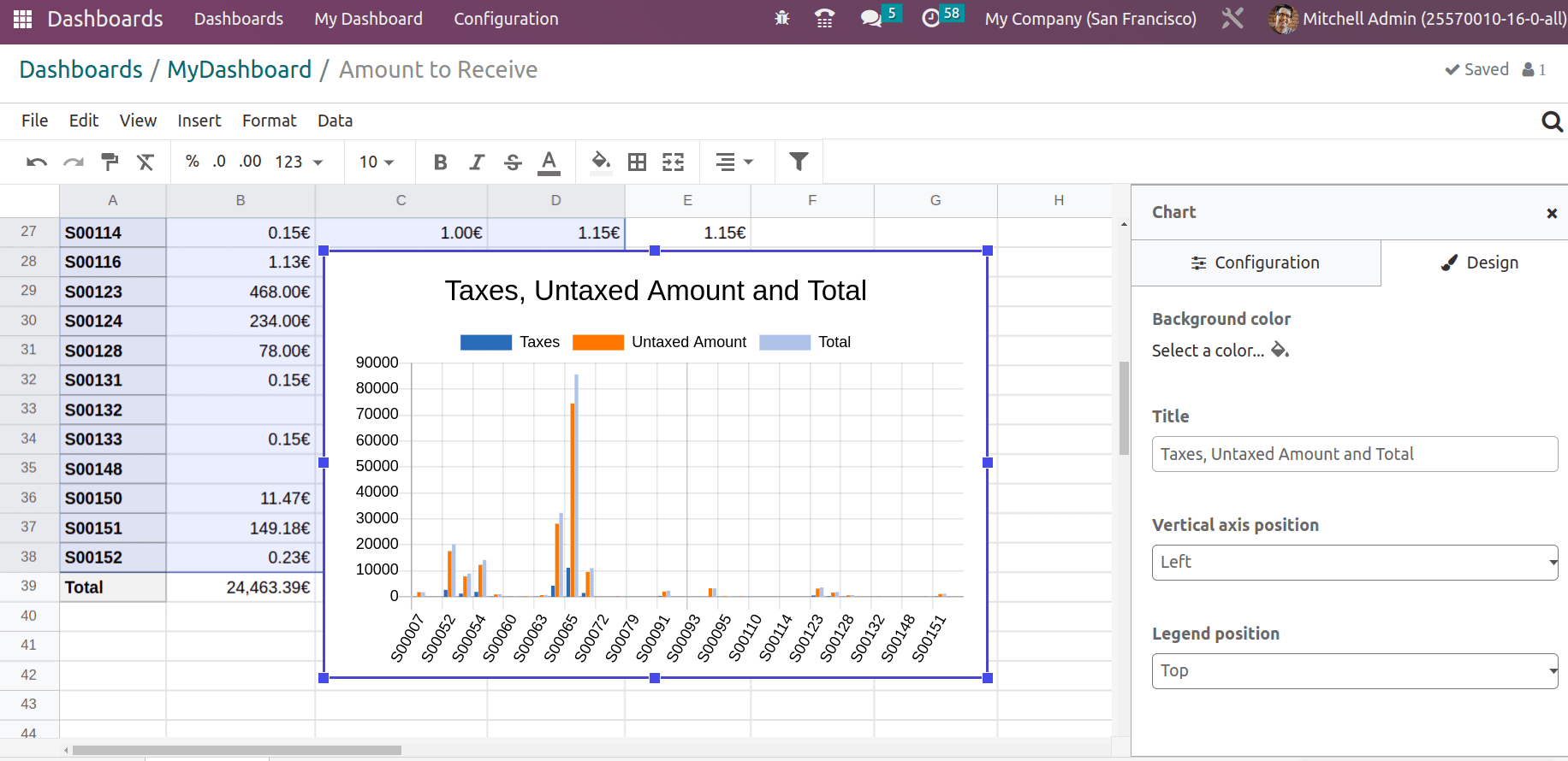
The legend position arranges the column name mentioned in the legend position.
Another chart type is Scoreboard, which adds a scoreboard to the spreadsheet and some comparison to a targeted value shown below.
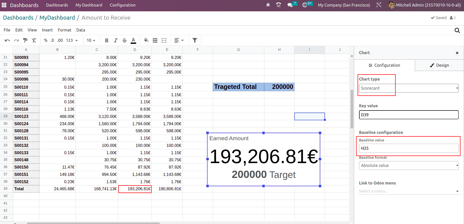
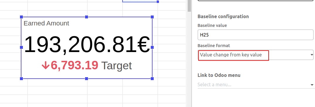
A scoreboard is created on cell D39, which is the earned amount from the sales. H25 is considered as the sales targeted value to achieve. Thus a scoreboard comparing achieved and targeted amounts can be taken. The baseline format defines how the scoreboard appears, either Absolute value (see in the above screenshot) or value from the key value, or Percentage change from the key value.
value from the key value
Percentage change from the key value.

So one can add the baseline format and on the Design tab, the Title and Baseline description can be added.
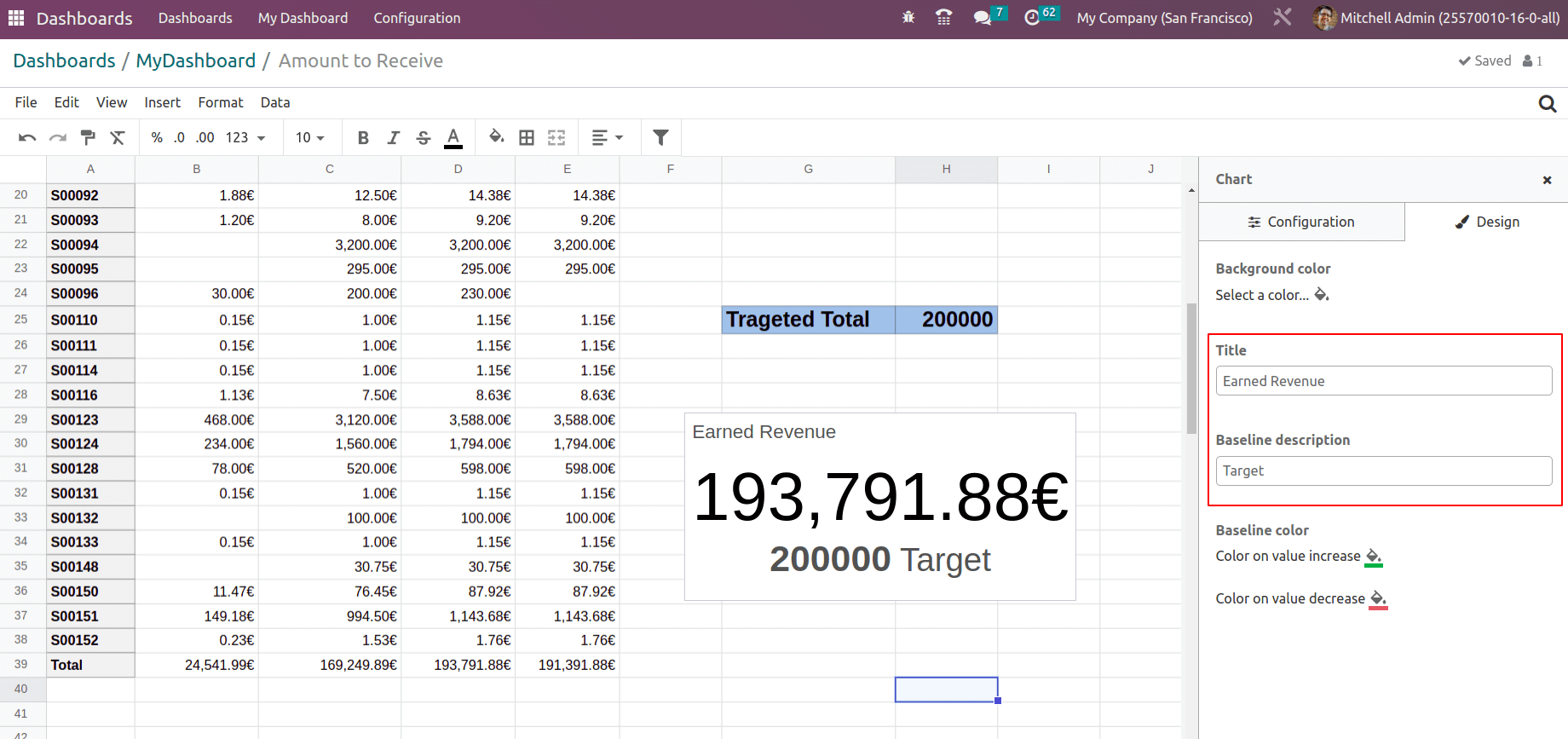
Using Spreadsheet tools one can arrange the data. Whatever information that added to the spreadsheet can be inserted into your dashboard.
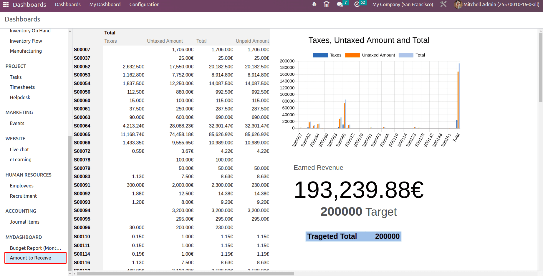
Note: Spreadsheet documents are kept in the documents module. But if any user has updated the data of the spreadsheet document from the documents module, it won’t affect the dashboard. Dashboard data can be updated, only if the user edits the spreadsheet document from the dashboard module only (using the edit option).
Adding Filters
Dynamic dashboards are preferable to static dashboards. With filters, data can be filtered from the existing dashboard. So filters that can be applied to the spreadsheets will be available in the dashboard. Let us edit the spreadsheet and add some filters.
Here a team analysis data is added to Mydashboard. A filter is applied based on the salesperson so that it will appear in the dashboard as well. Choose the column for which the filter needs to be added and click on the filter icon.
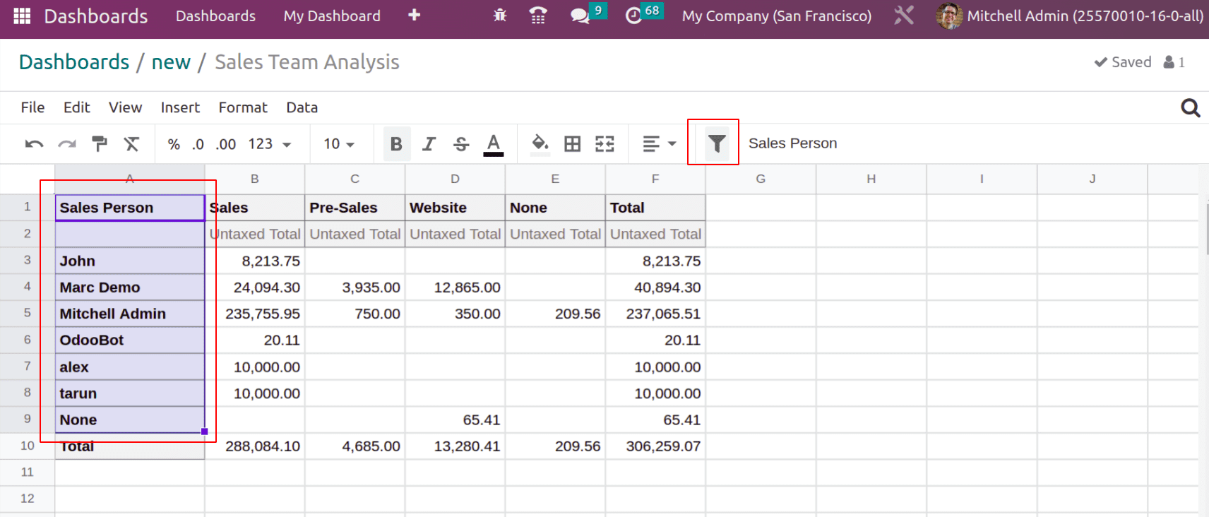
This will bring a filter for column ‘Sales Person’.
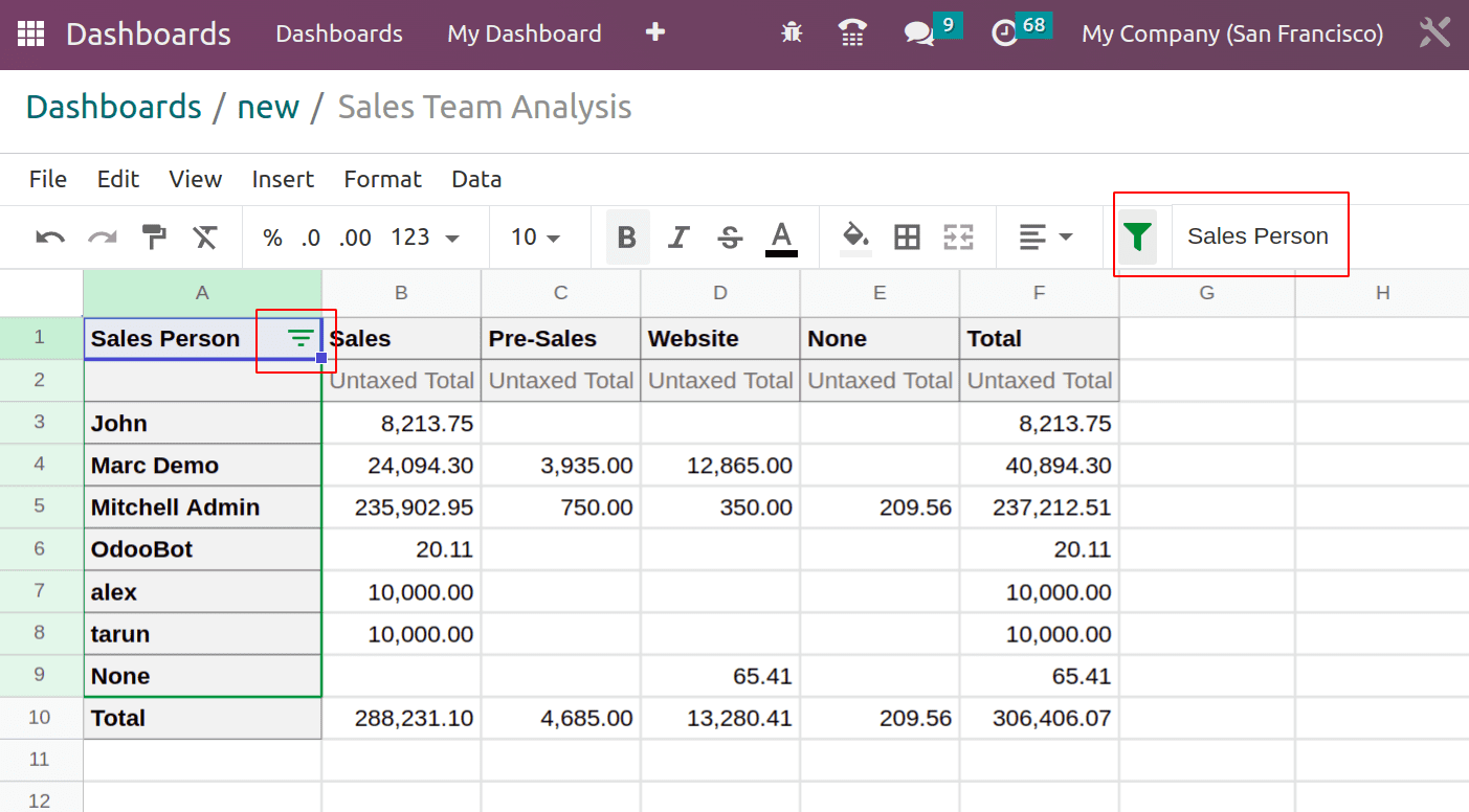
Now save the changes and open the dashboard. Thus the added filter is available in the dashboard.
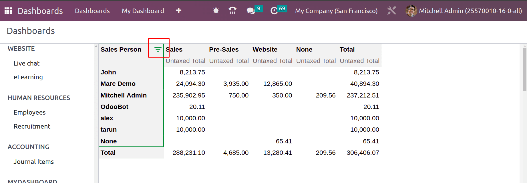
The filter shows the salesperson, which it can be chosen from the dropdown to show the respective data only.
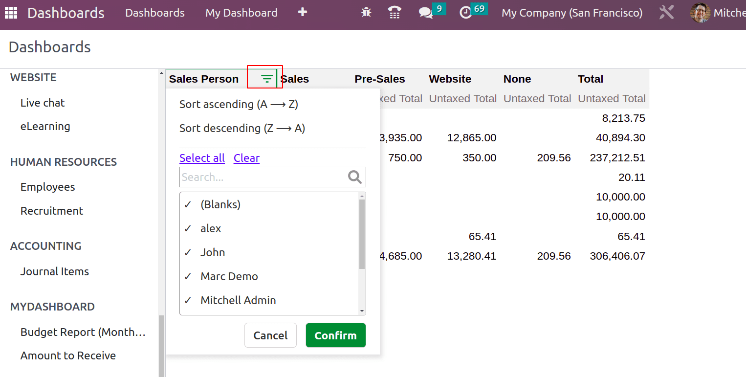
The Select all selects all the salespersons and the Clear option clears all the selected filters. Also sorting options are available to sort details from A to Z and wise versa. Like this multiple filters can be applied.


