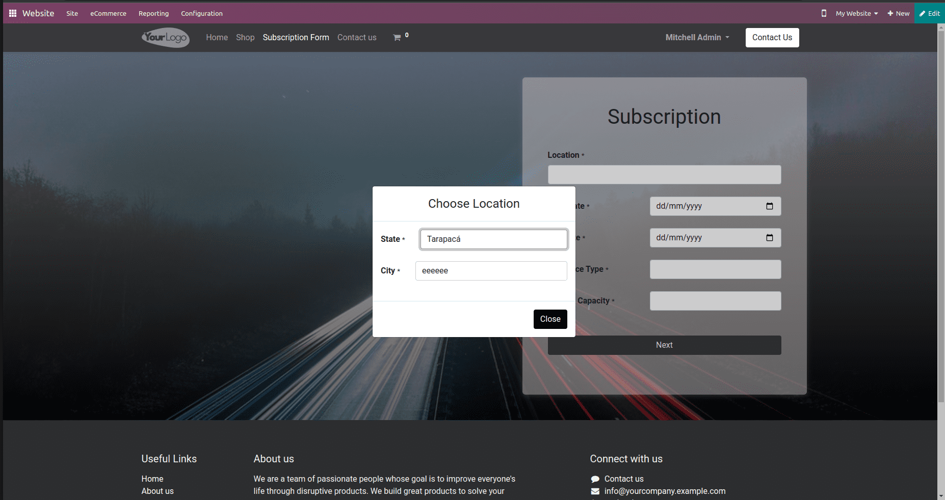
In Odoo 16, a modal is a user interface component that is commonly used in web design and software applications. It is like a pop-up that overlays on top of the main content. It is used to display and interact with specific information or perform certain actions without navigating to a new page, that is perform a particular task without navigating away from the current page.
Now, we can check how we can implement it in Odoo 16.
First, we need to define the modal content; that is, we need to create a QWeb template to define the content of your modal. Then we need to add modal logic to Javascript.
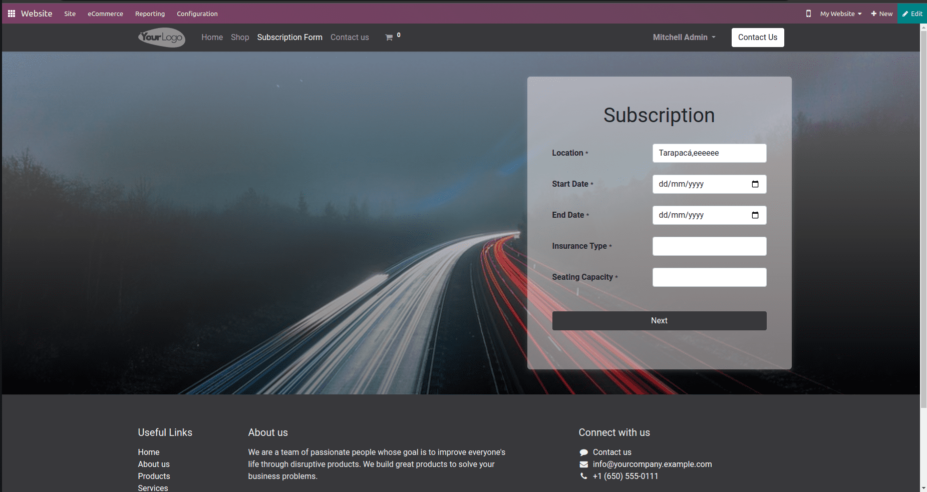
For example, on clicking the Location field, the corresponding modal will be displayed as a pop-up so we can specify the details of the Location like State and City. While closing the modal, details will be shown in the corresponding field where the modal has been opened. That is, in our example, the details will be shown in the Location field.

While clicking the close button, data will be shown in the location field, as shown below.

So, the template for opening modal is given.
<template id="subscription_form" name="SubscriptionForm">
   <t t-call="website.layout">
       <div id="location_temp" style="display:none">
           <div class="modal-dialog">
               <div class="modal-content">
                   <div class="modal-header">
                       <h4 class="modal-title">Choose Location</h4>
                   </div>
                   <div class="modal-body">
                       <labelclass="col-form-labels_website_form_label">
                       <span class="s_website_form_label_content">State</span>
                       <span class="s_website_form_mark">*</span>
                   </label>
                   <div class="col-sm">
                       <select id="state_id" type="text" class="form-control s_website_form_input" name="state"
                               required="1">
                           <option t-att-value=""/>
                           <t t-foreach="states or []" t-as="state">
                               <option t-att-value="state.id" t-att-data-state-name="state.name">
                                   <t t-esc="state.name"/>
                               </option>
                           </t>
                       </select>
                   </div>
               </div>
               <div class="row s_col_no_resize s_col_no_bgcolor">
                   <label class="col-form-label col-sm-auto s_website_form_label" for="studio1">
                       <span class="s_website_form_label_content">City</span>
                       <span class="s_website_form_mark">*</span>
                   </label>
                   <div class="col-sm">
                       <select id="city_id" type="text" class="form-control s_website_form_input" name="city"
                               required="1">
                           <option t-att-value=""/>
                           <t t-foreach="cities or []" t-as="city">
                               <option t-att-value="">
                                   <t t-esc="city"/>
                               </option>
                           </t>
                       </select>
                   </div>
               </div>
           </div>
           <div class="modal-footer">
               <button type="button" class="btn btn-default"
                       id="dismiss" data-dismiss="modal">Close
               </button>
           </div>
           <div class="col-sm" id="col-sm-location">
               <input id="location_id" type="text"
                      class="form-control s_website_form_input"
                      data-toggle="modal"
                      data-target="#location_temp">
               </input>
           </div>
       </div>
   </t>
</template>
<div id=”location_temp” > This div element defines a hidden modal that will be shown when certain conditions are met. Modal Content: The content of the modal includes fields for selecting a state and city. The form fields are structured using Bootstrap’s grid system, which divides the content into columns. The user can select a state from a dropdown and a city from another dropdown.
<div class=”col-sm” id=”col-sm-location”>: This div contains an input field (<input>) that is displayed on the main page. When the user clicks this input field, it triggers the display of the hidden modal defined earlier. The data-toggle and data-target attributes are used to specify that clicking this input field should toggle the modal with the id “location_temp”. In summary, this XML template defines a hidden modal that appears when a specific input field is clicked. The modal contains form fields for selecting a state and city. This is a common pattern for providing an interactive and user-friendly way to gather location information from users on a website.
Now we need to use JavaScript to open the modal by clicking the location field.
_onLocationClick: function (ev) { //function that opens modal
    var modal = document.querySelector('#location_temp');
    var location = document.getElementById('location_temp');
    location.style.display = 'block';
},
The function _onLocationClick is designed to make a hidden modal element, usually represented by the ID location_temp, become visible by changing its display style property to ‘block’. This typically happens when an event (like a click on a button) triggers the function. As a result, the modal becomes visible to the user.
_onCloseClick: function(ev) {
    var location = document.getElementById('location_temp');
    var city = this.$('#city_id')[0].value
    var state = $("#state_id option:selected").data('state-name');
    document.getElementById('location_id').value = state + ',' + city
    location.style.display = 'none';
},
_onCloseClick function is intended to handle the logic when the user closes the modal. It updates the input field’s value with the combined state and city, and then hides the modal by changing its display style property to ‘none’. This is a common pattern for updating a field with information from a modal before hiding it.
In Odoo 16, a modal is a user interface component that is commonly used in web designing and software applications. It is like a pop up that overlays on the top of main content. It is used to display and interact with specific information or perform certain actions without navigating to a new page, that is, perform a particular task without navigating away from the current page.
To read more about open the form view of many2many clicking tag in Odoo 16 refer to our blog How To Open The Form View Of Many2many Clicking Tag In Odoo 16


